The Basics Of Navigating OurHome.NYC
OurHome.NYC is a free, easy-to-use online mapping and data tool created by the nonprofit Measure of America with funding from The Urban Institute using funds provided by the Robert Wood Johnson Foundation. OurHome.NYC depicts the relationship between health, as measured by life expectancy, and housing across more than 300 New York City Housing Authority (NYCHA) developments, featuring life expectancy estimates and other well-being indicators for all NYC census tracts that contain NYCHA developments. NYCHA residents, policymakers, and community-based organizations can view and compare over 150 health-related indicators to make informed decisions, advocate for change, and better understand a development or neighborhood.
This guide is intended to help users navigate OurHome.NYC and is organized by the site's three main interfaces: MAPS, DASHBOARDS, and CONNECTIONS.
Tip: OurHome.NYC works best in full screen mode, or when it covers most of the screen.
INTERFACE #1: MAPS
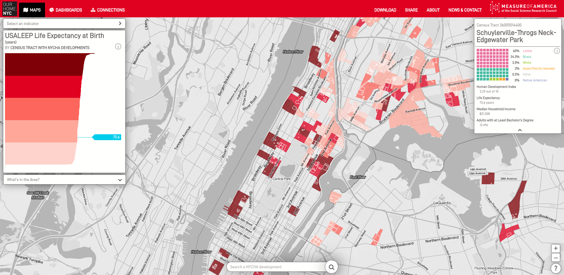
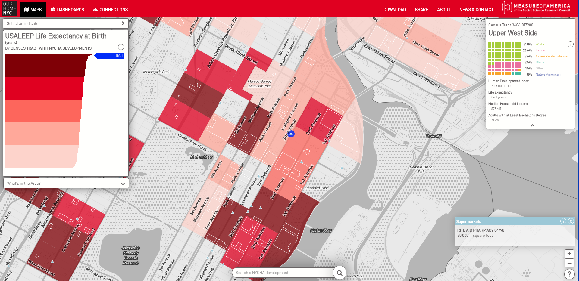
The MAPS view allows you to produce NYC maps for over 150 health-related indicators by census tract that contain NYCHA developments. These indicators are grouped into seven categories. Using the MAPS view, you can:
- map the variation in one indicator across NYCHA developments in all five boroughs
- view basic demographic and socioeconomic information by census tract
- compare two census tracts on a given indicator
- overlay the locations of twenty-one "What's in the Area" points onto the map. "What's in the Area" include public, nonprofit, and private facilities that matter for people's well-being, such as schools, parks, senior centers, libraries, soup kitchens, homeless shelters, supermarkets, and others.
- find the source of every indicator
- share or print your unique map
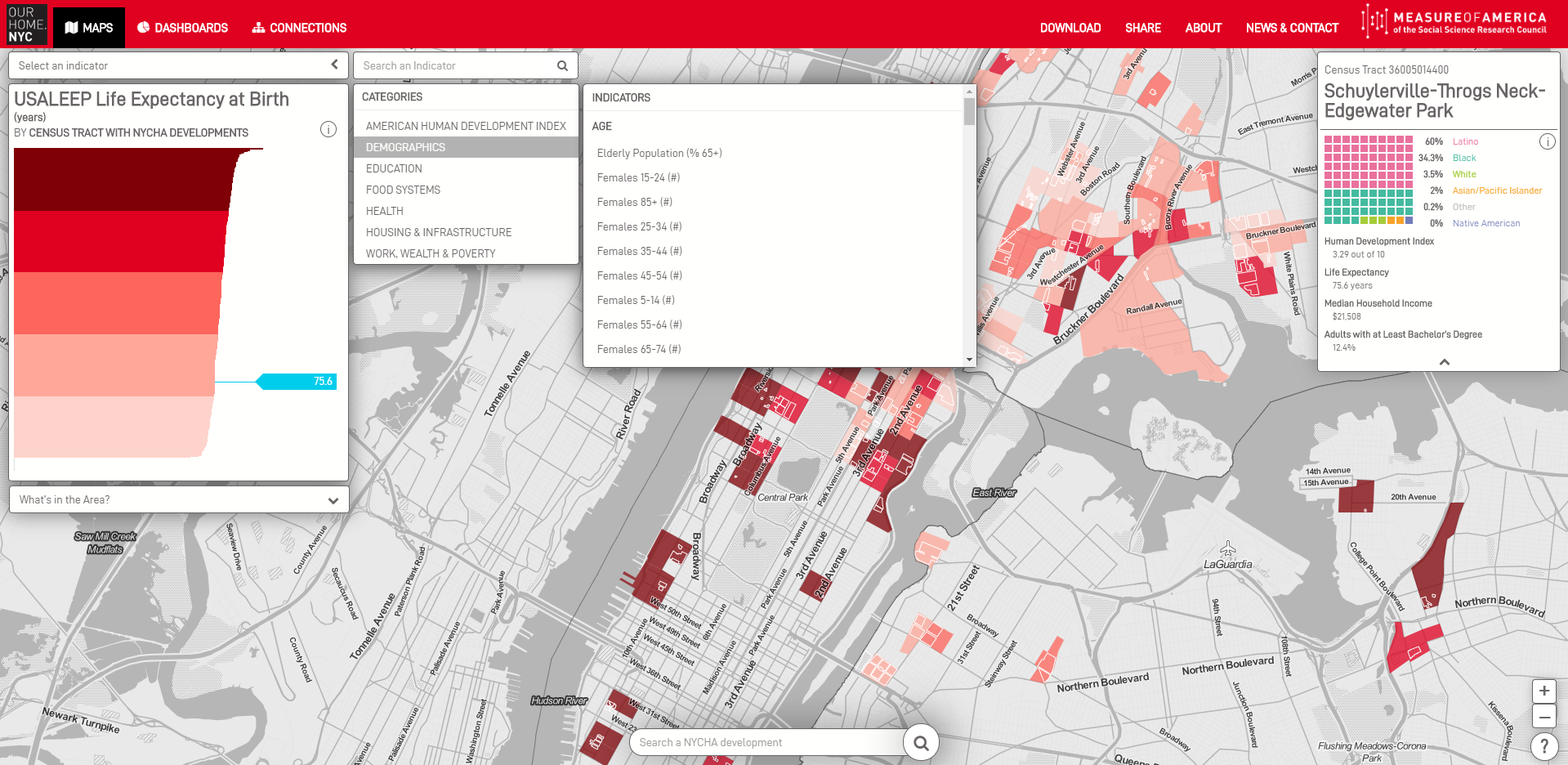
There are two ways to select an indicator. Click on your selected indicator via the drop-down menu in the top-left or type in the search box to find what you are looking for. The indicators are grouped into seven categories.
Tip: The darker the color on the map, the higher the value of the chosen indicator.
To map data for a different geographic area, there are two options:
- Click anywhere on the map. If that census tract contains one or more NYCHA developments, tract-level data will appear on the map. The census tract of your selection will turn blue.
- Click anywhere on the red bar chart. The value of the indicator for the "bar" you have selected will appear in blue and the tract that corresponds to that bar will also be blue.

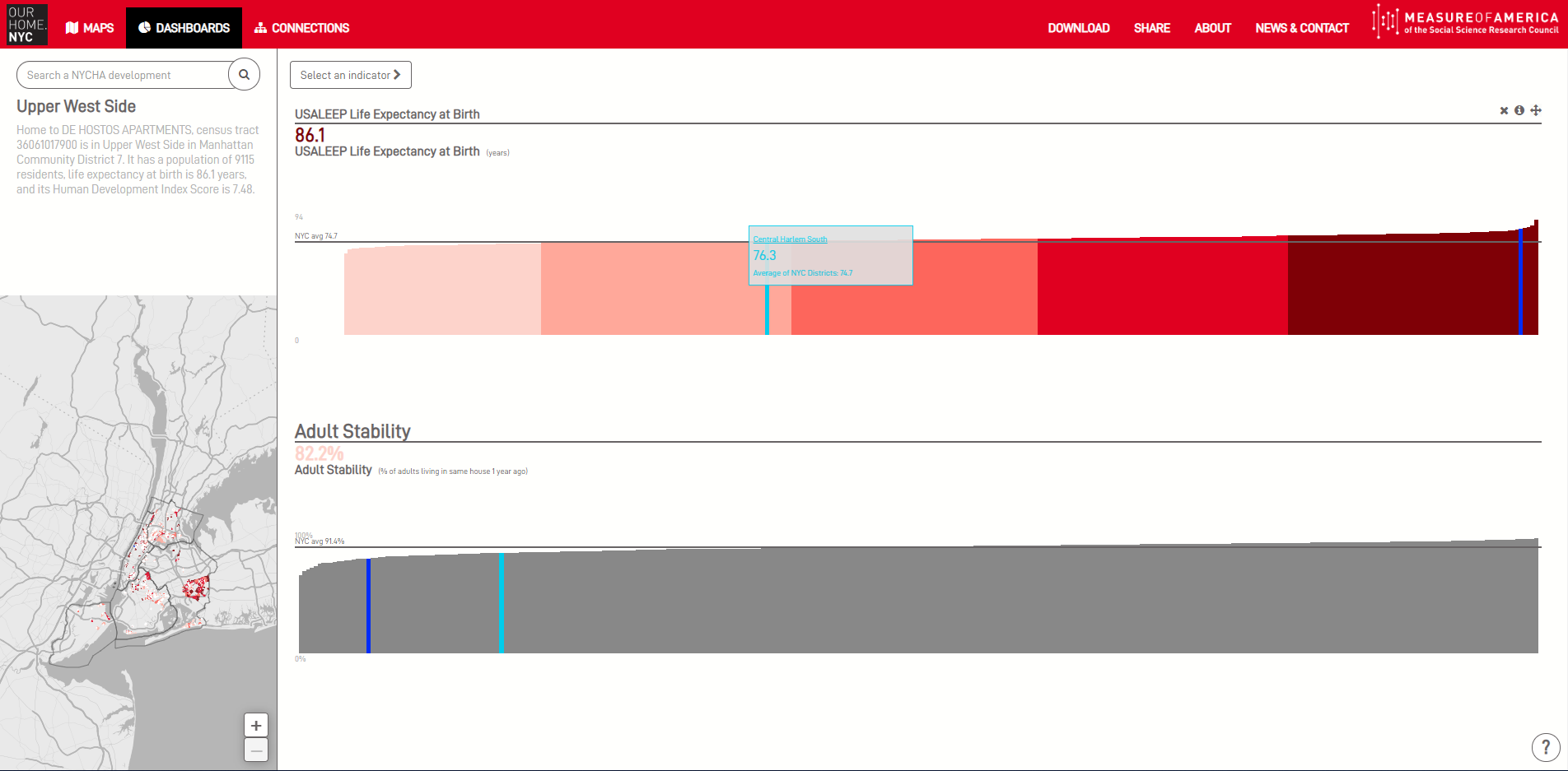
To see the value of a tract on your chosen indicator, click on the red bar chart. On this chart, you can also:
- explore the full range of values for every indicator by putting your cursor over the bars
- compare the value for two tracts that contain NYCHA developments on that indicator. The blue denotes the tract you have selected and sky blue is a second tract.
Tip: The US Census Bureau divides New York City into 2,168 census tracts. OurHome.NYC allows you to view data for the 377 census tracts that contain NYCHA developments.
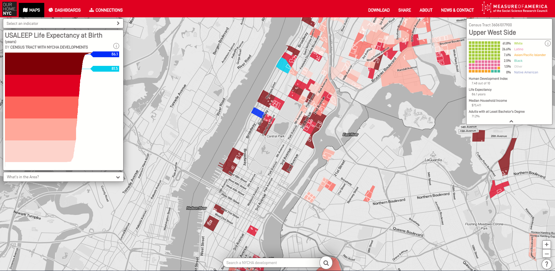
In addition to the chosen indicator, the MAPS view provides the racial and ethnic breakdown of the selected tract and some basic socioeconomic data in the right-hand box. This box includes the tracts's American Human Development Index value. The American Human Development Index is a measure of well-being and opportunity. It is made up of health, education, and earnings indicators and expressed on a ten-point scale.

Tip: To find a specific NYCHA development, put the name of the development in Search at the bottom of the screen.
Click on "What's in the Area" below the red bars to see how facilities like subway stations, homeless shelters, libraries, parks, schools, supermarkets, and waste facilities relate to the indicators on your map.

Select any of the twenty-one features and the map will be populated with a dot per facility.
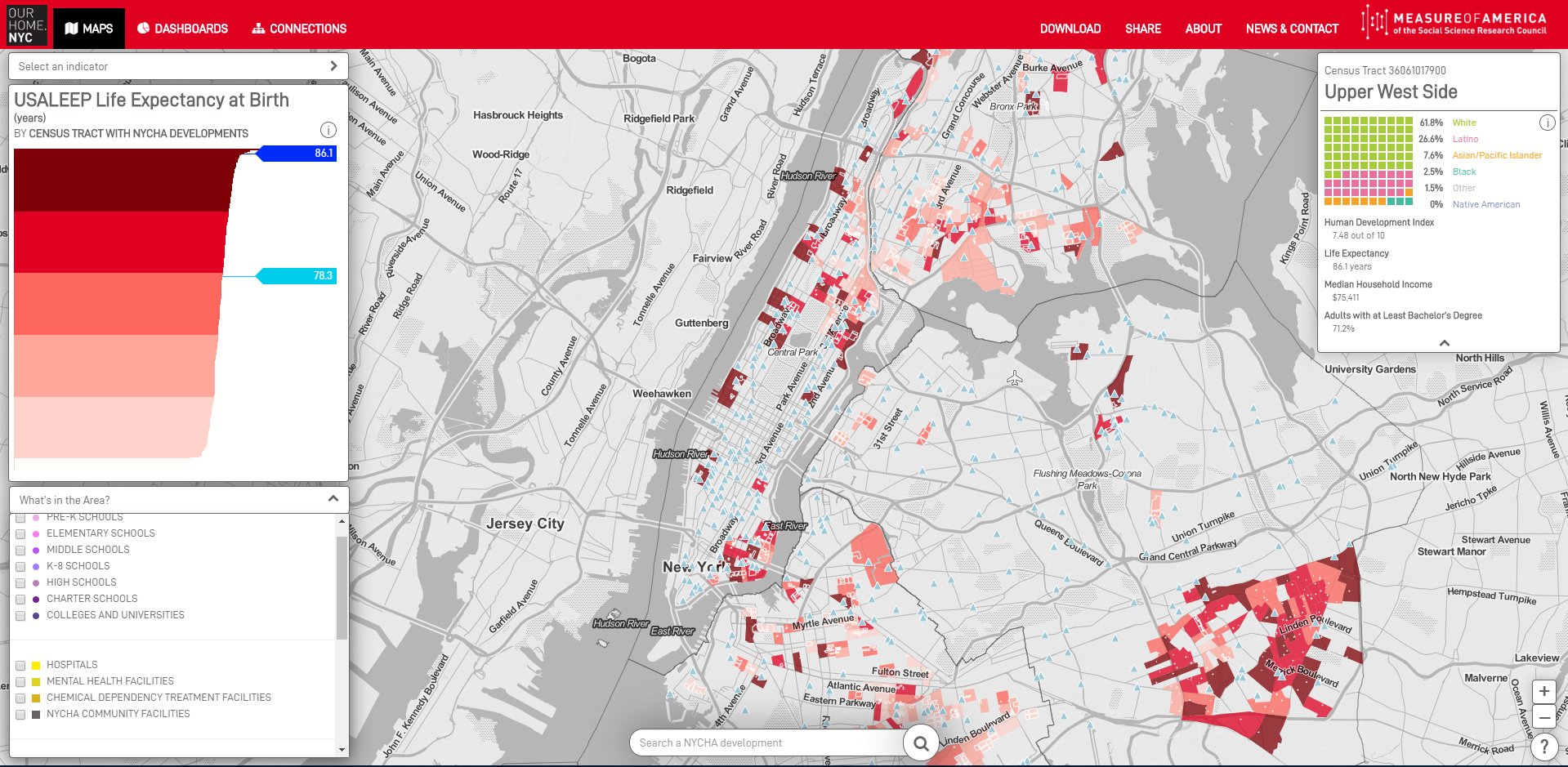
For most of these features, there is additional data per facility. Click on one of the dots and additional data about that facility will appear in the lower right section of your screen. To remove the feature, unclick the box.
To find the source of an indicator on the map, click on the to the right of the red bars. To find out the source of information on specific facilities, click on the on the top right of the facilities information box. Doing so will tell you where the data come from and any important clarifications or caveats. Click on Get Data to go to the website where the data can be found. For some indicators in OurHome.NYC, the data are not publicly available or have been geocoded by Measure of America to be available by census tract. In these cases, click "DOWNLOAD" on the top right to access the data in Excel or .csv spreadsheets.
INTERFACE #2: DASHBOARDS
MAPS displays a single indicator across New York City census tracts with NYCHA developments. DASHBOARDS, on the other hand, shows multiple indicators for a single tract. DASHBOARDS allows you to:
- select a unique set of indicators for a specific census tract as well as compare multiple census tracts on those indicators
- create a custom page with the data visualizations that matter to you by adding, deleting, or moving indicators
- view the source of every data point
- share or print your custom page with a unique link
The tract that you left behind in MAPS will automatically carry over to the DASHBOARDS view. To change the tract, click on the map in the bottom-left corner of your screen. The tract you have selected will then turn blue.
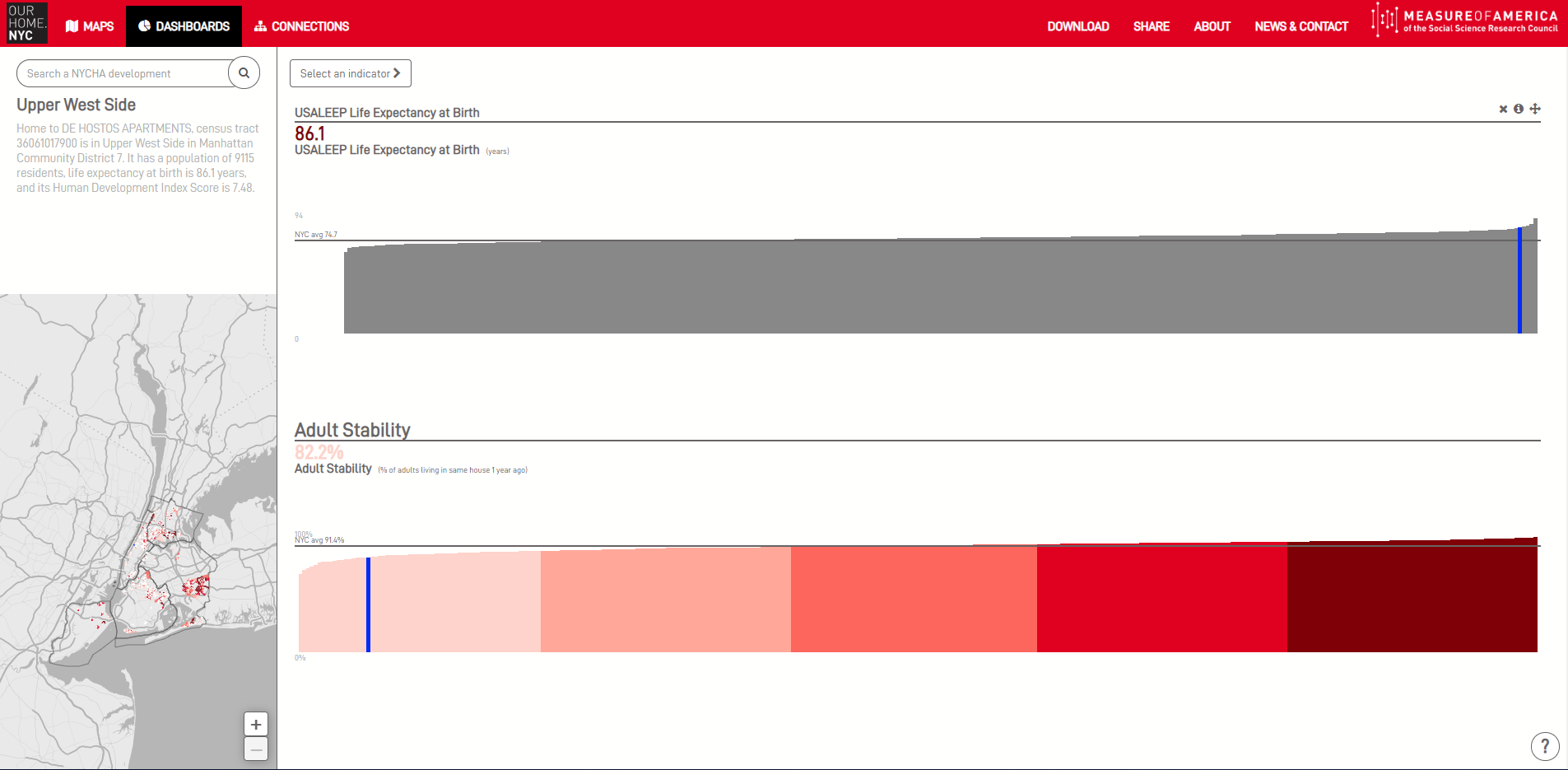
The DASHBOARD opens with data visualizations for a set of basic indicators. To create your custom view you can:
- DELETE visualizations by putting your cursor over the indicator title, which will bring up three symbols. The will delete a visualization.
- MOVE visualizations by clicking on the symbol .
- ADD NEW visualizations by clicking on Select Category for a menu of the seven indicator categories.
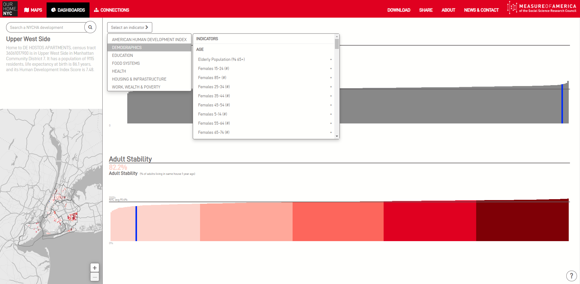
To add new visualizations:
- Select a category from the drop-down menu. All possible data visualizations (modules) in that category will appear in a line under Add Module.
- To add one to your DASHBOARD, click the icon and drag the visualization to your preferred location on the DASHBOARD.
- To reposition an indicator visualization, drag and drop while clicking the icon. You can have as many or as few indicators as you want on your dashboard.
- Change Category allows you to select a new category of visualizations.
To find the source of an indicator, click on the i in the upper right hand corner of the visualization. Doing so will tell you where the data come from and any important clarifications or caveats. Click on Get Data to go to the website where the data can be found. For some indicators in OurHome.NYC, the data are not publicly available or have been geocoded by Measure of America to be available by tract. In these cases, click "DOWNLOAD" on the top right to access the data in Excel or .csv spreadsheets.
INTERFACE #3: CONNECTIONS
The CONNECTIONS section of OurHome.NYC enables users to do two things: (1) explore the correlation between life expectancy and another variable across the 377 census tracts that contain one or multiple NYCHA developments and (2) examine how tracts that contain public housing developments stack up when compared with other tracts on the given variables. It answers this question:
"Is there a correlation between life expectancy and variable y, and if so, how strong is the relationship?"
On the Connections section are 28 y variables. To select an y-value, press the blue dropdown menu and a list of the y indicators will appear.
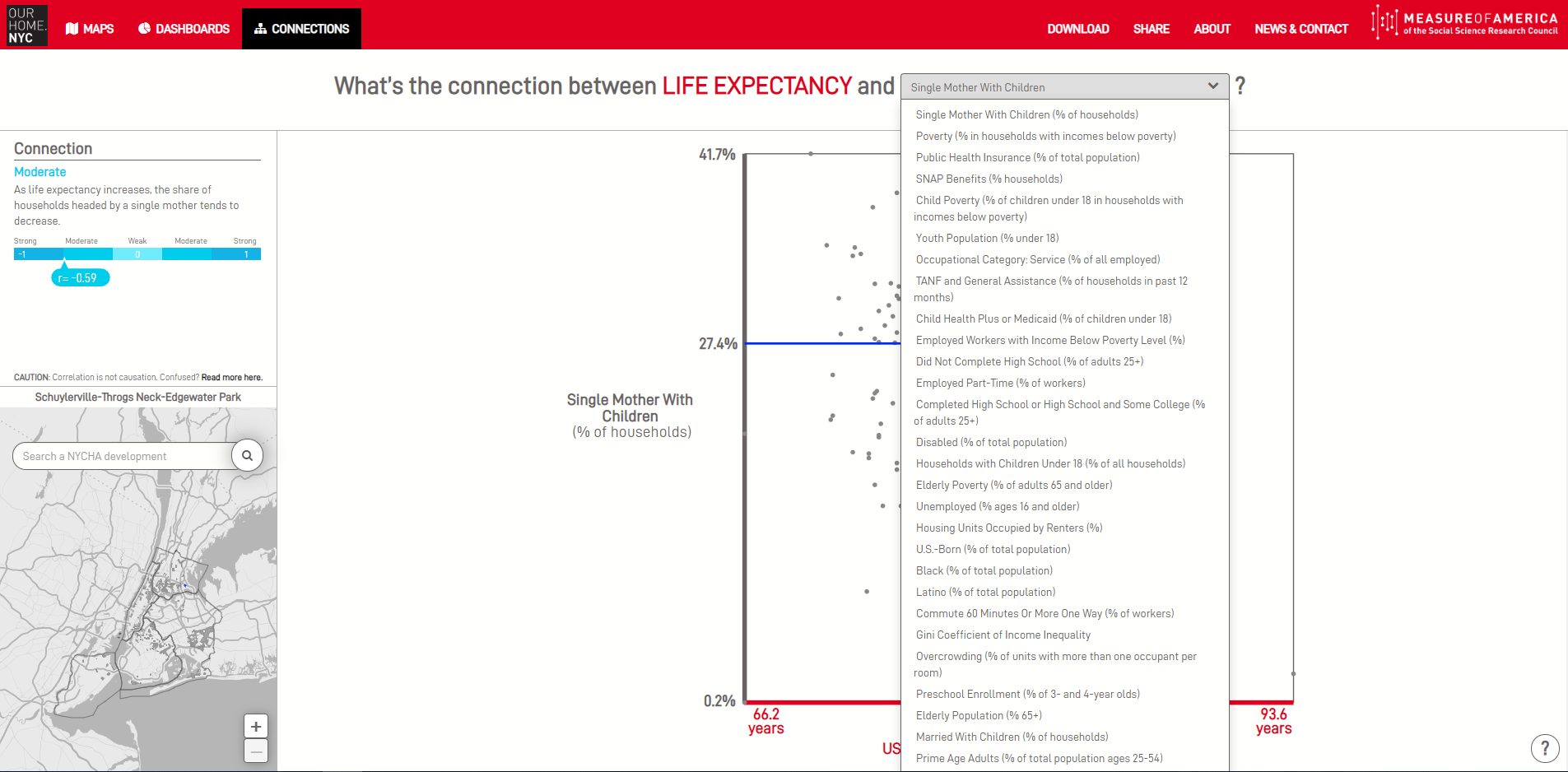
This will result in a scatterplot with three hundred and seventy-seven dots, one for each of the city's census tracts with NYCHA developemnts, and a sentence that answers the above question about the relationship between that variable and life expectancy across the city's public housing.
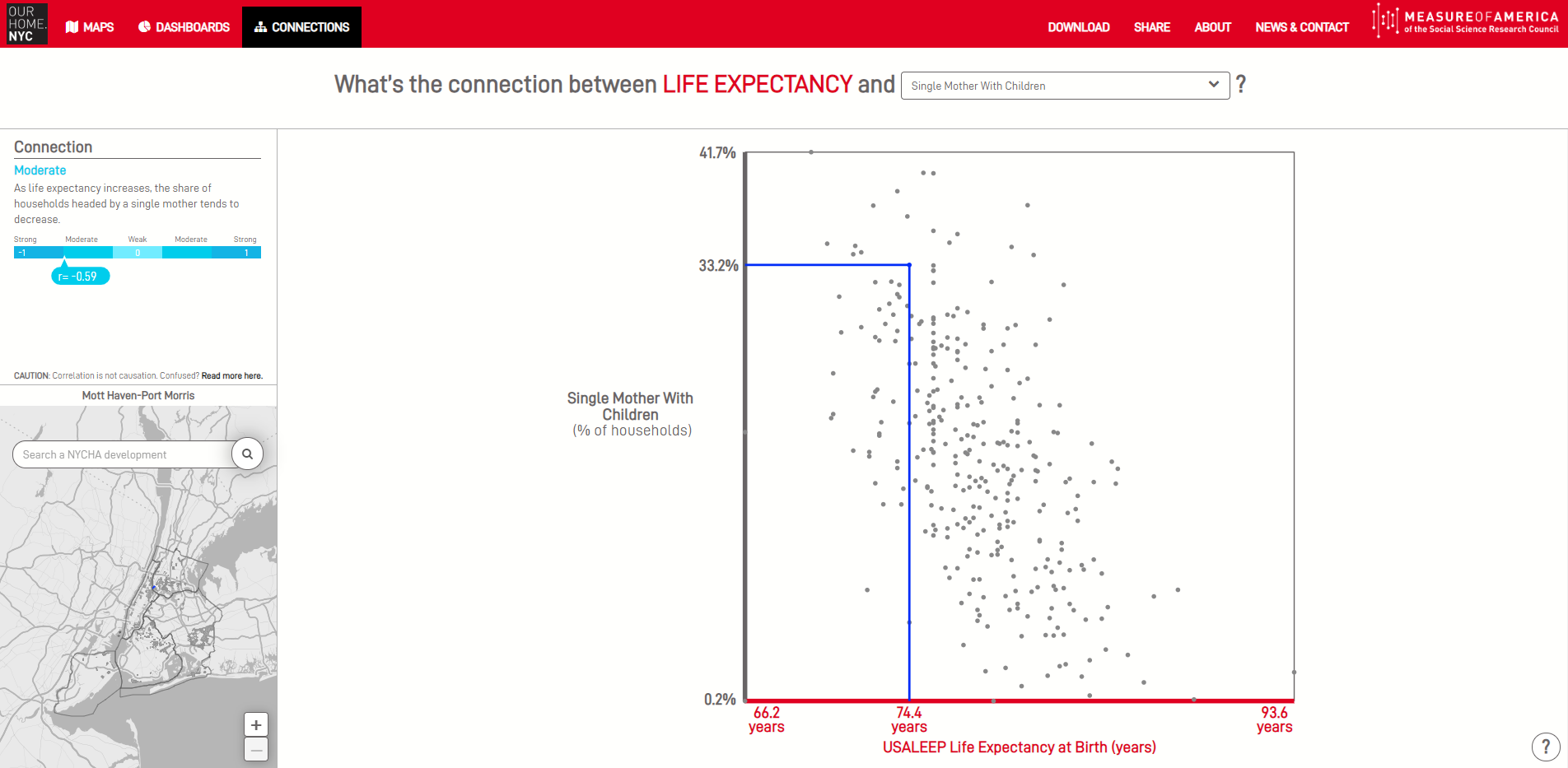
You can also learn about how individual tracts fare on these pairs of indicators by clicking on a dot. A line will appear that will tell you its x- and y-values. If you are interested in comparing this tract with another tract, click on a second dot.
Tip: CONNECTIONS uses Pearson's correlation, which measures the linear relationship between two variables. Pearson's correlation yields a number ranging from -1 to +1 and is represented with the symbol r.
CORRELATION DOES NOT IMPLY CAUSATION: The Pearson's correlation describes the linear relationship between two variables. But it does not prove that a change in one variable causes a change in the other variable. Determining causal relationships requires extensive research and subject matter expertise.
Downloading and Sharing

The SHARE button offers the option to share your custom MAP, DASHBOARD, or CONNECTION view with others using either Facebook or Twitter or print it the old-fashioned way.
The DOWNLOAD button brings you to a short form to complete before being able to download all OurHome.NYC data in a .csv or Excel file. Data are organized in the twelve categories. The only data not available in this form are the philanthropy data, which are available by subscription from maps.foundationcenter. org. The source data (accessible by clicking ) will bring users to the website where the data can be extracted. DOWNLOAD offers users the data already downloaded, extracted, and cleaned.